Sunday, November 30, 2008

WHAT IS STYLE?

WHAT IS STYLE?

Once I enrolled in a beginning photography art center class, taught by Gary Ciadella.
He sent us out to snap pictures of things, scenes, people, etc. which attracted us. When we returned with our newly developed black and whites, he projected our images on a screen.

I would never have dreamed beginners would display a group of pictures with distinctive characteristics different from every other person in the class, but that was what emerged! Every person displayed certain tendencies for certain types of composition, for either very dark or very high key scenes, and of course a preference for particular subject categories. Some compositions seemed to slide off the bottom of the format. Some were contained within tight boundaries. There were many more of these traits we all could identify and the differences between us were apparent .

I would define style as the unique combination of preferences, choices, or biases the artist employs during the creative process. This may include media, color choices, compositional preferences. Working within certain limitations may create a certain commonality in the work, interpreted as style. Subject matter, format shapes, intimate views, far away vistas, and more come into play. Much of this process is like hand-writing and is just as unique.

After that time, I never tried to “develop a unique style.” I was assured my style was already there, and that making every piece of art the best I could was a more important goal.

I am convinced that working diligently will ensure every artist will develop his or her own unique style. My advice to the beginner is to learn what you can from others, but to trust the result will still be your own original expression.

Work done in various media each may have the look of a different style. My own choice is to mix media and to choose the materials and tools which express in the best way I know the particular effect I am going for. It may appear sometimes as if I have no particular style, but that is a conscious choice. I can see direct relationships between one series and the next, and how what I have just learned is translated into the next body of work. I can articulate what those discoveries were.


MESSAGE

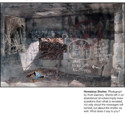
Later in the class mentioned above, Gary Ciadella showed us a series of photographs by world-renouned photographers. He asked us what the artists were saying with their pictures. We began to comprehend many possible meanings in these images.

Every piece of artwork says something, even if it is only about an abstract arrangement of shapes and colors. Awareness of meanings conveyed through images is inescapable for me since that time. Symbolism through imagery is absorbed even when the viewer is not aware. Advertisers are aware of this and use it all the time. If you are aware, you can resist their efforts to make you buy.

Sometimes an artist is aware of the message or idea they are trying to express. Sometimes a piece will say something else to the viewer. When more than one person sees something in your work you did not see before, and several interpret this idea the same way, it offers an opportunity to learn about what you are subconsciously saying with your work.

These two classes in photography affected all the artwork I created from that time on. To see the work of my former teacher, Gary Ciadella, click the links below.

www.carrciadella.com www.exclusivelyblackandwhite.com

Wednesday, November 26, 2008

WHAT MOTIVATES YOU TO MAKE ART?

Pink Landscape. Collage on Stuffed Canvas.18 x 24"

MOTIVATION

Inspiration is usually the source of an artist’s motivation for wanting to depict a particular subject, method, color combination, or idea as a piece of art.

Usually there is an initial drive to want to capture “something.” Inspiration motivates the artist to complete the work, even during disappointments and failures. While filled with emotion, it is a good time to articulate just what is the intention or goal to be accomplished.

During the actual work, the process itself may suggest new ways of working. The goal may be lost. The artist need not become bound to the original goal, but if the original intention has been understood, or even written down, there is always the option to explore different versions of the same subject and to return to the first concept. Subject inspiration, response, and process are so interconnected, it is often impossible to separate them.

The artist’s direction may change while creating a piece, as it did for me when working on this collage. It started as a piece of satin, which I marbleized as an experiment. This was sewn, stuffed and stretched with its canvas backing over a frame. Later I collaged computer printed paper strips on the surface to create the feeling of a landscape, using acrylic medium.

Whether by conscious choice or intuition, this kind of change in direction reflects growth. The evolution of choices leads to a refinement of direction, which uniquely defines not just one piece, but eventually, a body of work.

Being able to define these goals and the concept behind a single piece or a group of works will help the artist while working. Awareness allows adjustment.. It is the simple repetition of correcting something that leads to improved skill.

The artist must dismiss that negative little voice that tells him or her that s/he is “not good enough” rather than accepting that the painting, the drawing, or the photograph is not good enough. The real task is to learn how to make it better, and eventually it will be better than just good enough.

I have found it is easier to let go of preconceptions by working on “throw-away paper,” or to just allow an experimental process or technique to take over. Sometimes a remarkable accident has a wonderful impact. This affords and opportunity to shift, and work in a new way, or direction. Thinking about what was learned helps to integrate the discovery into the range of choices to be made in the future.

I would describe an artist’s process as a series of discoveries of what does work as well as what doesn’t.

The materials, tools, and medium used are the physical manifestation of that process. They record the artist’s journey, energy and handwriting left behind in that process. Employing a particular technique expresses the artist’s style. But it is the artist’s vision which creates the final work, and not the medium, or the tools.

Monday, November 24, 2008

DO YOU DEFINE YOURSELF AS AN ARTIST? A-1

Draft Horses. Mixed Media

How do you Define Yourself ?

I believe if anyone practices an art form they are an artist. Doing it well may simply require finding the best means of expression for your unique set of abilities, and dedicating time to it.
There are too many preconceptions about art and artists. My advice, choose which ideas are valid for you and discard the rest.

Success can be measured in the joy derived from the process of doing. It may mean achieving short or long term goals.

It may require having a self sustaining income from creating art, but it would be a very deprived world if only those who made a living, made art for all the rest of us.Those who are artists by avocation, contribute a great deal to the world at large.

Talent is a combination of traits and abilities. No one is born with their potential fully developed and ready to be expressed in a given area.

Aptitudes of many kinds can translate into the ability to make aesthetically pleasing art;

Visual orientation
Appreciation for color
An ability to draw
Manual dexterity
Appreciation for beauty
A desire to learn
Adaptability
A drive to express
The ability to abstract
A direct and/or indirect working style.
A creative mind
Motivation
Understanding of art
A love of materials
Mechanical ability
A hard worker and More.

Attitude. Even though different people have varying degrees of talent, it is possible for people with many different traits to prevail as artists because of attitudes including;

Passion for joyful creation
Desire to learn
Motivated to finish
Steadfast dedication
Sees “failures” as opportunities
Sees art as play or meaningful work
Belief in one’s ultimate success
Flexibility
Desire to please
Patience and More.

Experience Learning is accumulated through doing.
Skill is improved by practice.
Training may be obtained in a variety of venues. Formal training, private lessons, art center classes, specialized workshops, learning from books, working with a peer group, or just plain observation can hone ones abilities. Understanding is facilitated by a conscious effort to be aware, and to apply what has been learned one step at a time and over time.
Process evolves in the practice of making art. It includes the materials and techniques used, but it also includes inspiration, joy of doing, passion for expression of an idea, drive to achieve a goal, and it includes satisfaction in steps achieved well and determination to improve upon and learn from efforts which failed.

The Montage Workbook A-1. All rights reserved by Ruth Zachary.

Pages from the Montage Workbook will be lettered and numbered so they can be filed in logical sequence. Comments are welcomed.

Saturday, November 22, 2008

MONTAGE WORKBOOK SERIES - Introduction 1

Norris Road House. Watercolor, Computer Altered.

Introduction

The motivation for writing this weblog came from many people who have seen my work, and who have asked how it was done. I want to share this knowledge.

My methods have evolved through years of experimentation with many media, as well as through exposure in various classes and workshops related to a variety of media. In attempting to classify what I have learned, it also appears the evolution of my own learning experiences provided a sequence which could be useful in any artist's aesthetic development and awareness. An explanation of a process for one piece could not apply to all. I have kept extensive notes over time, useful for reference, but also made easily available for organizing into a catalogue of materials, approaches and techniques.

There are a variety of approaches to designing a piece of artwork, which I will share. I plan to include basic principles of design and composition. I will attempt to increase awareness of the message(s) that is conveyed by an image to the viewer. I hope, as well, to address some of the creative issues artists encounter.

Sharing what I have learned about mixed media, approaches to composition, collage and montage is the focus of this blog. I hope others will be able to use this information.


Comments are welcomed.


Images and writing are the exclusive property and Copyright of Ruth Zachary.

Tuesday, November 18, 2008

BALANCING THE ARTIST'S LIFE

I enjoyed the on line class, and am thrilled at all I learned. But suddenly I realized I had neglected a lot of other important things for two months .... like creating art!

I don't regret focusing on the class. That was my priority for that time. And look at all I accomplished! I added a second blog about writing, rzwritestuff.blogspot.com and another about my family history, Grandcestor Stories: vintagemontage.wordpress.com

In addition I created two lenses on Squidoo, on Womens Heritage Art and Vintage Montage, and began creating sites on Hub Pages, Twitter, My Space, Facebook and Linkedin. All these locations need to be attended to on a regular basis, and this can be very demanding, especially if tries to do too much. It is important not to get so overwhelmed, the process is no longer joyful.

The priority for an artist is to get all the many demands of life organized and being addressed in balance, on time, and according his/her own priorities. I am learning to allow myself to do just a little on each site until it is up to the standard I hold for myself.

And since all of those sites are about what I love doing, and feel as if I was created to be doing both art and writing, I feel I am on track!

I think it is part of an artist's process to reassess periodically. It was one of those times, back in August that started me on this new journey. I realized marketing effectively on the internet was one thing I had not tried, and resolved to do something about it.

Hunting on the web led me to Julia Stege's webinar. This has led to a new direction, and a change in the way I will try to expose my art and writing in the future. The marketing and production plan I imagined two months ago is changing as I go. And that is great, too.

Writing and images are the sole property of Ruth Zachary.

Saturday, November 15, 2008

VINTAGE MONTAGE USING PHOTOSHOP

Filling Her Shoes. Photo Montage. 9 x 12"

This piece reflects upon the relationship between the child and the grandmother, who in this case was the parent.

The montage images of the child and the grandmother were placed in a frame using layers in Photoshop. Portions were erased around the grandmother, to leave the child's photo dominant. The erase tool was used in paint mode, a large, #65, to create a blended edge on the cutout areas.

The background, the chest of drawers, pitcher and bowl, and the antique shoes came from a present day photo in an antique store, Lincoln Park Antiques, in Greeley. The frame was angled slightly, using the perspective tool to create the illusion of the photo turned to the left.

Color saturation of the modern photo was reduced using Image> Color adjustment tables. The antique photos were tinted slightly using a sepia color at about 20% value in color mode.

If anyone has additional questions about the Photoshop techniques used here, please ask. Also I would enjoy comments from you.

Comment
"Your photo montages are.... like someone's special dreams you're allowed to peer in on. I find them as rich and interesting as looking at my Grama's curious things, her button collections, from dresses I remember. Her fine leather boots - which seem so improbably matched to anything I ever remember her doing. Her crazy daisy little hats that were linked with had stories of her zany sisters..... I continue to think of them, and how they made me feel to see them at the gallery and your home; they certainly give tremendous mileage of thought, feeling and memory. The feelings they evoke still linger and ...are all tatted in now with the narrative threads of my own Grandmas and Aunts." Julia and Renee


Art images and writing are Copyrighted by Ruth Zachary.

Thursday, November 13, 2008

MIXED MEDIA

Dreams Gone By Mixed Media.
Giclee Prints, 12 x 14"

Mixed Media; The Best of All Worlds (for complete expression of artistic vision.

This original mixed media montage was created using a variety of techniques, and was accomplished before the availability of Photoshop.

The photos were heat transfers of color xerox enlargements from old photographs, ironed onto the paper background so they would all be on one surface. (The back of the piece still has scorch marks from the iron.)

The images chosen to combine into one included childhood photos of my mother and father, an old house which had been their honeymoon home, the house they later bought and where I was born.The porch was reversed from the same photo used in a previous etching (The Homecoming) shown earlier on this blog.

The next step was the use of doilies, and living flowers and plants, laid directly over the transfers, to serve as stencils. Some of the photos were protected with paper to retain the photographic details. Green and brown spray paint were selectively painted on the stencils, through to the paper. After this was dry, and stencils removed, a checkerboard pattern was drawn selectively onto the paper, the squares filled with colored pencils, to suggest quilt blocks, and the country flavor of this nostalgic memory.

The use of the mixed media enabled more choices than only one would have afforded alone.

I have started a new blog, rzwritestuff.blogspot.com. The new blog will be about writing, and so I will gradually be moving posts about writing, in this blog, over to that site.


Permission required for use of writing and images Copyrighted by Ruth Zachary.

Thursday, November 6, 2008

EMOTION AS A CREATIVE STIMULUS

Apron Strings. Copier images and chine colle.
Image size 17x22"

Strong emotional feelings about a subject is a great stimulus for creative expression. (This is true for writing as well as in creating images. At the point in life when this image was made, I was torn between the role as housewife and mother, and another desire to pursue a visual arts career. I had to work much harder, for longer hours, and still keep up with my housewifely chores in order to be an artist. In some ways working in an office and visiting homes was much less physically demanding. I traded it in for the personal satisfaction of being creative.

The shoes represented the two competing roles. The boot was worn in my print studio, while the low heeled shoes were worn at my previous job as a social worker. The two aprons represented the two different worlds, as well. I pretty much gave up the decorative apron for the practical printmaking apron.

As I worked, these symbols evolved in my mind and demanded to be pictured in a comment about my conflict. I saw that it was not my conflict alone, but one that was quite relevant for other women as well.

The piece was executed by using the copy machine as a camera, and then collaging the parts into a still-life sort of montage, which was re-copied in two parts on rice paper. The toner remained stable when the paper was dampened. The two halves were then placed face down on a blank zinc plate, flour paste applied to the back, and a damp print paper laid over that. The press rollers applied enough pressure to cause the rice paper to adhere and bond to the heavier print paper. (Chine Colle was described previously in The Homecoming.)


Images and Writing are the sole property of Ruth Zachary.

Tuesday, November 4, 2008

METAPHORIC MONTAGE

All Adults Must Be Accompanied by a Child. 18 x 24"

This montage image was stimulated by the idea that all of us, no matter how old, carry elements of our childhood with us, and that people's personalities are at least in part, formed by our early preferences, abilities, and environment. It is in its depiction of various symbols, a metaphoric montage about life.

This particular montage departed somewhat from my Women's Heritage theme, because it relates to people in general, of different genders and cultural and ethnic backgrounds and not specifically about women. It has similarities with the earlier piece shown, The Homecoming, both because it deals with ideas about childhood, and in the way the images are presented, with an architectural structure forming the background for various associations.

Executing the ideas in this piece was a lot of fun, and I hope the humor is conveyed to the viewer by the suggestions about the people in it. Sometimes the humor is a little grim, I admit, and it slides over into the genre of social commentary. But overall, viewing the piece can be entertaining, and the final conclusions are totally up to the viewer.

I welcome comments and feedback about this piece, and especially how others respond to it.


Images and writing are the sole Copyright of Ruth Zachary, and may not be reproduced without permission.