Monday, December 29, 2008

THE MANY WAYS TO PRESENT A SUBJECT


SUBJECT TREATMENT

Finding a slightly different emphasis or viewpoint to get the best perspective, can make the subject more commanding than simply settling for a less than interesting first view.

If the subject is what inspired the work, and the artist is motivated to say something about that subject, how it is portrayed is vitally important.

But even if you do not have a great view of the subject to work with, it is still possible to rearrange or add to or subtract from the view you have to make a dramatic composition of the creation that results.

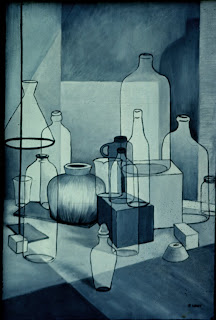
Still Life. Oil on Canvas by R. Wagy

Still Life: Draw, paint or photograph the various objects in a still life grouping. If possible move around to get the best view you can of the grouping. If you can’t move around, or rearrange the still life arrangement, draw the objects in different relationship with each other.

It isn't always required to present the subject realistically. One way to change the way you present the subject is to treat the objects with outline, filling in solid areas.

Lighting. Consider side lighting, back lighting or low point lighting to create an unusual view of your subject. At some times of the day, bright illumination creates interesting shadows. The photo at the top of this page illustrates the impact shadows can have at the end or beginning of the day.

Other times the even lighting of an overcast sky is better than unwanted shadows.


Distant or Intimate View?

Consider whether to present the subject from close up or from a distance away. If you are showing off a beautiful costume or capturing an especially interesting expression, probably an intimate view will serve you better.

Think about your choices and what you are trying to say. Choose to place the subject at one side (assymetrically) or centered (symetrically) of your picture plane. With animal or human subjects, do you prefer a direct gaze or averted gaze ? Either may say something about your subject, or this choice may express something about yourself. If your preference is strong, so that you repeatedly present subjects with an averted gaze or a direct gaze, it may be a trait that becomes part of your style.

Images and writing are the property of Ruth Zachary.

Tuesday, December 23, 2008

POINT OF VIEW

Photos for painting, Bicycle Cafe. Several photos were taken of the scene, with various possibilities for an interesting composition. My final choice would probably be the second one shown. (Click on the image to see three versions)


POINT OF VIEW

A dramatic or dynamic presentation of a subject in a composition is very important. The artist's point of view or perspective has a great impact on the final composition.

Some artists claim the composition is far more important than the subject. I have even heard this from teachers in a drawing or painting class, who said this in a classroom where many of the students did not have a very interesting view of the model, or of a grouping of several objects in still life. But there is no substitute for finding that best arrangement before beginning to work.

As can be seen when several pictures of the same subject are presented from different points of view, there is a difference. Preference has a lot to do with development of style, as well as learning to present a subject effectively.

The artist owes him/herself the extra time it takes to get the best possible point of view, whether photographing, drawing or painting the subject.

If a tree is the subject of a landscape, twelve different perspectives might result in several versions to get the very best one to convey its special quality. Hopefully, this in turn will capture the viewer and communicate the inspiration the artist experienced in the first place. Several exciting images could also result in a series.

Placement of the subject within the picture plane is also critically important. Composition and design attempt to present a subject in the best possible way, to convey the feeling, character, impact, or mood that inspired the artist in the first place.

NEW SERIES OF TECHNIQUES.

This leads to the next group of blog posts, which will illustrate a variety of options for presenting a subject, or Subject Treatment.


Images and Writing are the exclusive Copyright of Ruth Zachary.

Wednesday, December 17, 2008

COMPOSITION IN REALISTIC ART

Faded Photo of the House on Norris Road

House on Norris Road. Computer Adjusted Photo
Colors were enhanced, contrast increased, and some
window details were created by copying parts of them
where details were absent.

The Country Doctor's Home. Watercolor.
The image was enlarged and painted from the adjusted
photo. Areas of watercolor were loosely splashed onto
the surface, before refining the desired details. Some areas
were left vague to encourage the viewer's eye to move
around within the picture plane.


Composition in Realism

Realism is sometimes thought to be only copying nature by abstract artists or artists working from imagination. But anyone who had worked in darkroom photography knows there is often an elaborate manipulation of light, dark, contrast, texture, emphasis, placement of elements through cropping, dodging and burning, and by employing other means before a photograph is finished. The result is far from the first impression of nature.

The artist who paints consciously to create a skillful composition has controlled the combination of elements within the picture plane, until it is no longer simply a “copy” of nature.Successful realistic painters do this as well, even those using photographs as a means of beginning.

Realistic artists also bring together disparate elements to create one painting, although the final version may appear to be completely realistic in presentation.

The above painting used both indirect impressionistic methods and selected areas of directly painted realistic detail to blend both into a completed composition.

Recommended Books: For two dimensional artists seeking fresh approaches for presenting realistic subjects, I recommend:

Creative Landscape Painting by Edward Betts. (Watson Guptill 1978) and
Concept and Composition by Fritz Henning, (North Light Publishers 1983)

Many of these approaches can be applied to still life, figurative work, and other subjects as well as landscape painting.


Images and Writing are the exclusive Copyright of Ruth Zachary.

Tuesday, December 9, 2008

COMPOSITION IN TWO DIMENSIONS

COMPOSITION

In two-dimensional art, composition and design are defined by the elements within the picture plane. Composition employs certain principles to capture the viewer’s attention and keep it moving within the picture plane

The illusion of dimension is created by various means, such as perspective, diagonal lines, diminshing size and height of objects, faded and undetailed distant shapes, and a a tendency for distant forms to be more neutral in color and to have less contrast.

Certain principles and rules of nature lead the eye around the surface or through the implied space of the picture. By using these principles or purposely breaking the rules, attention can be directed to different parts of the picture plane at the artist’s will.

Design principles attempt an aesthetically pleasing or dramatically demanding effect which can be learned, practiced, and almost unconsciously integrated into the way an artist works. These principles are inherently part of the natural world, and often children have a natural sense of composition in their art expressions.

Basic elements of design or composition to be mastered include: Balance, Contrast, Movement, Rhythm, Repetition, Variety, Unity, Harmony, Simplicity, Complexity, Proportion, Principles of aesthetic picture plane division and more. Whole books have been devoted to the subject, and so not much pertaining to these principles will be included here.

Three books I would recommend are:
Art Fundamentals – Theory and Practice, by Ocvirk, Bone, Stinson and Wigg.
Composition in Art, by Henry Rankin Poore (Avenel Books)
Composition, by David Friend (Watson Guptill)

Wednesday, December 3, 2008

WHAT APPROACH IS NATURAL FOR YOU?


The Direct Approach
People who work regularly often find they work more naturally if they approach the process in a particular way. Some artists start with an idea of what the finished piece will look like, with the arrangement of the elements in the picture plane at least generally pictured in their mind. This can include more or less detail. It may entail working with a photograph to work from while creating their rendering.

A direct approach can be used to begin a piece, with the compositional elements reduced to basic shapes and reinterpreted as textures, color areas or abstract relationships to result in totally unrecognizable shapes. A gradual completion of the imagery can evolve into something completely different than the original concept. Often the way the medium and the ways the images affect each other influence the artist to let the work emerge. This almost feels like the “painting that paints itself.”

This is an add-to approach, applying more detail to what is already there.

The Indirect Approach
In a sense, the process of letting a painting happen in the way described in the previous paragraph is an indirect approach, or a combination of both direct and indirect approaches.

This approach often begins by using a series of experimental media, methods and/ or techniques to create uncontrolled effects. Then the artist takes a direction for the work from what is suggested by the accidental results obtained, and develops it according to the suggestions or cues seen there.

One type of indirect approach is to take away media or imagery rather than to add it, much in the way of carving away clay or stone to bring the image out of the material.

Combination.
Think about what is natural for you… do you work better by adding information to an image, or do you find taking away imagery is easier? Is your best work done by a combination of both approaches, adding something here, taking something else away, until you like what finally emerges?

The Designed Approach
Basic shapes are used to define the major elements of the picture plane. In two dimensional art the format is divided by geometric or organic shapes, or both, and the direction of the piece uses either planned or indirect imagery which is subordinated to the overall design.

Images and Writing are the exclusive Copyright of Ruth Zachary.