Monday, January 19, 2009

SUBJECT TREATMENT: LINE

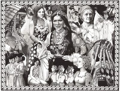
Daughters of the Earth. Pen and Ink.

LINE

Line is probably the most primitive method of creating shapes, maps, or writing. The mind recognizes the edges of shapes as they stand out against a background. Lines are formed by edges of things. As children we usually made a line indicate a shape or several shapes to make a human form, a house, the ground, a tree, and the sun, before filling in those shapes with color.

Line as a way of indicating a subject has evolved through the ages, so that lines and dots also form tones, shadows and suggest three dimensions even though we draw in two dimensions.
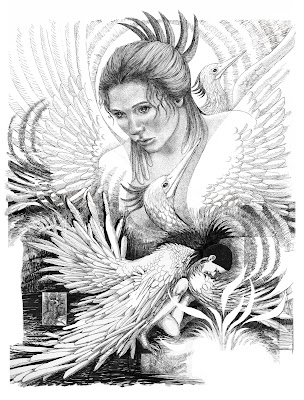
The Phoenix Always Rises. Pen and Ink

Line does not have to be limited to black on white. If you find line a natural way of expression for you, try using color. Try widening your lines. Draw in pastel, crayon, or the side of a 2 " square piece of mat board dipped in watercolor. Make lines and areas of color with the square of mat board. Think of using white on black or on a deep solid color.

Scratch board is a chalk coated board which if colored with inks can be scratched through, making white lines, looking like pen and ink in reverse.

Lines can be painted with a brush. Go back a few posts in this blog (Dec. 29) to look at the bottle still life, which used outlined shapes and solid flat shapes shaded in with paint to suggest dimension, without much modeling on the surface. One object was modeled in three dimensions to create a contrast and draw the eye to that focal point.

When looking at objects in a painting or in real life, notice the contours and boundaries. These are lines which have direction and movement. Lines draw the eye in the direction they point toward. The goal of an artist is to keep the viewer's attention inside the picture plane long enough to see everything you placed there. Controlling the lines in your composition will help to do this. Lines with the most contrast are the most noticable.

Diagonal lines tend to create an illusion of depth, or perspective. Diagonal strokes behind a figure give the impression that the space behind the person or object is not flat, and when used on the the figure will imply the figure has dimension, as well.

There also needs to be a place where the eye may comfortably leave the frame if desired, or quiet places within the picture plane which create a sense of peace, or a welcome place of rest for the viewer.

Writing and Images in this blog are the property of Ruth Zachary.

Tuesday, January 13, 2009

FORMAT SHAPES AND DIVISIONS

Atargatis. Chine Colle. An example of vertical divisions within a horizontal rectangular composition. Notice the horizontal fish border at top.

Most picture plane surfaces are rectangular or square. Placement of your subject within these shapes is related to the success of your finished composition. If you are depicting realistic subject matter, your choice of placement in a horizontal or vertical orientation is important if you are to present your subject to the best advantage. If your work is abstract or non-objective, you can make the work fit the shape.

Where the focal points are located within this picture plane is also important.

As mentioned in the last blog post, it is possible to vary the shape of your composition within the picture plane by creating various format shapes within the outer picture plane boundaries.

The space within the picture plane shape or format shape may be divided in some general ways:

•Rectangles and squares. Most compositions will conform to a rectangular or square shape with either a Horizontal format or Vertical format.


Format Division
Within the inner format shape, the space may be delineated and characterized by Horizontal, vertical, diagonal or organic divisions, or a combination of all of these. Generally the shapes within the composition characterize these kinds of divisions, even when they are organic,
or represent the major boundaries of the subject.

Barn on Marsh Road. Mixed Water Media. This composition uses the diagonals of perspective to divide the picture plane. The shorelines, the barn roofs, reflections and receding foliage create the illusion of depth, and also lead the eye into the distance.

Other kinds of format divisions:
•Geometric Grids and diamond grids can be used to divide the picture plane.
•Other geometric shapes, triangular, hexagonal, etc.
•Circular, arched, or oval shapes.
•Organic divisions.
•Combinations.

Bridge. Created in a children's computer program, KidPix, and later enhanced using Appleworks and Photoshop. Note how the geometric compostion remains 2-dimensional in spite of many diagonal lines throughout.

Images and Writing are created by Ruth Zachary and are not to be copied without her permission.

Thursday, January 8, 2009

DESIGNING THE PICTURE PLANE


Picture Plane shapes

The usual picture plane shapes are rectangular, vertical, horizontal, square, or sometimes round or oval. If a bias develops for one shape, it may be challenging to arbitrarily work with another shape. Some artists even create irregular shapes for their picture plane, perhaps to accent an element depicted.

It is possible to create a specific shape within the given picture plane, leaving a neutral boundary area around the main composition. Again, Format shapes may be geometric, circular, rectangular, organic, symmetrical, assymmetrical, or may spill out of the picture's inner boundary, as in the image below, Chameleon.


Summer Lace
. Collagraph

Artists are accustomed to planning art on paper knowing it will be matted when framing. Matting can be used to alter the compositional shape. When creating art on a board or canvas, it is also a good idea to create a quieter area at the outer edges of the composition, to visually separate the image area from the frame.


Format shapes can be designed on canvas, board and paper surfaces, either in advance of working, or afterward. They can be circular, oval, arched, notched, rectangular, combination shapes, organic, etc. as with the above listed possibilities.


Chameleon. Computer Photo Montage.

It is possible to incorporate a composition which falls within an organic shape, as with the etching below, Damselflight. The lower area contains less imagery but the top is more active near the edges. This piece is always presented with a mat.

Format division as another approach to design. The picture plane can be purposely divided into segments for another effect, and for a new design challenge or approach. They can be geometric or organic. This can occur with both realism and abstract work.

Even if the format is not obviously separated by lines, the elements within can still form divisions within the picture plane. Divisions can be geometric, or they can be organic or a combination of both.


Damselflight. Etching


I'll Never Come This Way Again.
Watercolor and collage.

Consider the various options for dividing the format of a composition. Divisions help to organize elements into an order which can make the whole more interesting to view. Look at format shapes and divisions in galleries, art shows, note cards, architecture, and book illustrations. Consider using some of them.

The next blog posts will feature illustrations of different kinds of format divisions.

Images and Writing are the Copyright of Ruth Zachary.