.
IMPROVE THE ODDS OF HAPPY ACCIDENTS Part 3
.
The next experiment is to use three layers in the same way as two layers are used in the previous exercise. The “mode” setting is applied to the top two layers in varied combinations.
.
Note: It is possible to work for hours and not find one happy accident that has potential to become a finished work of art. Other experiments may produce many images that can be the start of something really worthwhile. This approach can be quite time consuming.
.
There are certain elements of composition which make an image more or less effective. When combining layers in Photoshop, using the “mode” setting under the Layers tableau, to create accidental effects, choosing combinations that contain certain elements tend to produce better compositions.
.
These include: One layer with fine but varied textures, a second with medium to large shapes that will affect the division of the picture plane, and a third with medium sized patterns. A range of light to dark values in all three layers usually result a more dynamic composition. A combination of geometric and organic shapes will also create more interesting images. Usually. They are accidental, after all!
.
A good composition leads the eye of the viewer to various focal points within the picture plane, but creates enough interest to keep the viewer’s attention for a reasonable length of time. An all-over texture or pattern by itself tends not to offer enough variety to maintain that interest. The artist strives to learn what is effective in achieving this.
.
In the past demonstration, from April 26, three kinds of images were layered to produce a fourth image. Go back to that post to consider the following points about the process of using modes in Layers. The first textural image feels unbalanced. The second is incomplete, and somewhat unsettling. The third (from a tie-dye) is exciting, draws attention, but is rather symmetrical, almost static, and can quickly lose the viewer’s attention. The fourth version, obtained by combining the previous three layers using mode adjustments is more interesting. The three rectangular shapes were created by copying parts of one area into other areas, but more work was needed to command the viewer’s attention. I would add some other shapes, keeping to an uneven number as this us usually more dynamic. I would like to accent the suggestion of depth.
.
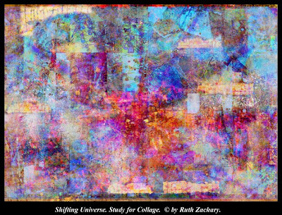
Later, I did take example #4, and added shapes to make it more interesting. Then I layered it again with two different textural images, resulting in the image above. One was a crackle texture, originally photographed from an old door. The other was a texture created in Kid Pix, which used paint tools, geometric divisions and outlining of the shapes thus created. Experiments with these three layers resulted in an image close to the one shown above. I made color adjustments, dark and light adjustments, and contrast, to deepen areas of the composition. You can see the resemblance to the tie-dye configuration, but now the picture plane contains areas of emphasis, textural interest, and areas of hazy mystery, with a hint of depth.
.
This is a study. At some point I will probably print it out. Other papers of related colors and shapes will be added and moved around until the whole is transformed into a pleasing environment where I want to take a vacation for a while.When it seems finished, I will eventually show the finished collage.
.
Images and Writing are Copyrighted © by Ruth Zachary.

No comments:
Post a Comment