Tuesday, September 14, 2010

MONTAGE IN ILLUSTRATION


 .
A MONTAGE APPROACH to ILLUSTRATION
.
Recently, I assembled a book of Poetry, which is about women who seek to define themselves within the culture at large, and have chosen new names which they feel help define this new identity. The cover, to be in color, was a colored pencil drawing on collaged papers and is shown above.
.
I decided to include 10 illustrations, black and white images of the etchings originally in color. The illustrations do not directly illustrate any particular poem. But the relationship of metaphoric imagery to metaphoric poetry reveals both to be part of a similar process. When and if the book is published, I will announce it on this blog and on my rzwritestuff blog, as well.
.
Because I am so busy arranging the poems, proofreading and polishing them, I have fallen behind on my intended schedule for blogging on four different sites. I have not included many Etchings on this blog in the past. .I thought using the etchings as images would be appropriate at this time and might help me keep up with this blog. Many of the etchings are montages of more than one element. I will include the color versions here in the coming series of posts. They are still available as giclee prints, but most etching editions were sold out. 
.
The image above used collaged papers which were created by cleaning off printmaking rollers after printing color etchings, and sometimes viscosity etchings. After the background was assembled, colored pencils were used to draw the wolf, the landscape and wolf pack elements, and the woman. I tried to make the woman look like a wolf, with almost golden eyes.

.
Images and text are the exclusive copyright © of Ruth Zachary.

Sunday, August 29, 2010

INTEGRATING REALISM INTO ABSTRACTION


Alabama Patchwork ii Collage by Ruth Zachary 
The first image shows how the figure looked after layering it over the blue background, in the luminosity mode. Note that very little color change occured in the gray scale drawing of the figure. The color in the figure drawing was achieved with acrylic paints used as watercolors matching hues in the background. Some distortion occurred in the second version because the varnish deepened the color. The image was photographed. The camera also distorts the straight borders at edges.
 
INTEGRATING REALISM INTO ABSTRACTION

In the previous post a figure was layered over an abstract black and white background, with the clothed model contrasted in grayscale tones.

I keep trying these experiments with color as well as black and white, because my original vision was to integrate realistic imagery into abstract shapes and textures.The blue-toned abstraction from the “Where Visions Gather,” series was chosen to be the background for the same fashion figure used in the previous post, inspired by Natalie Chanin, an Alabama clothing designer.

The figure, in grayscale tones when tried in various modes, applied as a top layer over the blue background resulted in a primarily grayscale image in many modes, with a few areas where the colors from underneath came through the figure. (luminosity mode)

The solution for this piece was to print the figure out in gray tones and then to paint areas which were in the color palette of the blues in the abstraction. Acrylic paint was used in thinned watercolor technique. Once dry, the whole composition – background and figure could be collaged to the Masonite panel with acrylic medium. Some compositional changes were made to the background before it was complete.

The figure was thus subdued to blend with the motifs of the underlying composition.This is much different than the figure used over the bold black and white patterns of the previous illustration. Both have merits, and the artist must choose the effect wanted.

The Masonite panel was prepared with a coat of water-based Kilz on both sides, and a second coat of gesso to the smooth surface side. Usually papers are collaged to the smooth side. The paper used was Epson matte Professional paper in a medium weight. Epson inks are colorfast, but some mediums and varnishes will dissolve and deepen the colors when applied to the surface. Test the products used together to be sure how they will work.

Small areas of the design elements were briefly soaked in water and the medium was applied to the panel, carefully placing the paper on the surface. One or two coats of matte medium were applied to the finished surface of the collage.

Note to my Readers:
I have been elected as secretary of the board of my church, and have less discretionary time than I had prior to taking on that duty. I still try to produce art, to write and create or manage other projects, including yard maintenance, but I will not be able to attend my blog as often as before.

Writing and Art Images are the sole © Copyright of Ruth Zachary


Tuesday, July 20, 2010

LAYERING FIGURE DRAWINGS OVER A BACKGROUND


DRAWING USING AN ABSTRACT BACKGROUND.

I have been experimenting with creating abstract black and white drawings. For this I have been using the computer. Several related pieces of the series started with the same basic shapes, including lettering in some shapes, and rearranging them in different configurations.

Drawing has been done on the computer with various techniques. These include, erasing through a dark layer to a white layer beneath, or through a light layer to a dark layer beneath, directly with the paint or pencil tool in black or white on a contrasting shape, or cloning from another area of established texture to put bits of it somewhere else. Some shapes were cut out, copied and rotated to complete the design. Lines and directions were accented to make the composition dynamic and balanced. Cutting a shape creates an additional different set of shapes. Often I use the “invert” command under image, to create dark where there was light, and vice versa. This too creates different shapes.

I was inspired by a fashion design I saw in Vogue, recently, and wanted to capture the rich textures of the different fabrics, using ink and pencil.  I used my own model for the face. I changed the fashion design slightly from the one created by Natalie Chanin, from Alabama, in my drawing. I included her name as a tribute to this woman’s work, because she is both an innovative artist and a person who values recycling.

 Notice how she collages different patterns and textures into one design, and then sculpts the figure with the volume and depth of fabrics and cording in the clothing and headdress. As an artist who works in collage, and has also worked in fabric collage, how could I be anything but inspired by her designs?

The drawing was rather light or high keyed in value next to the stark darks and lights of the background behind the figure. I increased the contrast of the drawing so it didn’t get lost, but left it in a grayscale to contrast with the background. The background creates the impression of a patchwork quilt. I think the blacks, whites and grayscale tones are very effective. You almost get a sense of color where there isn’t any.


Writing and Art work by Ruth Zachary © Rights reserved.

Monday, July 12, 2010

COMPOSITION IN BLACK AND WHITE

Link


Playing with Letters, unfinished study 

for black and white abstraction © by Ruth Zachary. 

The Shape Shifting Approach to Composition

 .
Moving varied shapes around the picture plane is my first step in starting a composition.
 .
When using color, the shapes are best when they are varied by hue, value, and size. I prefer organic, irregular shapes in uneven numbers. I prefer to work in related hues, or family colors on the color wheel. The values of the shapes might range from dark to light, unless they are to be placed against a background, which should contrast with the shapes.
 .
Some of the same principles apply when arranging shapes in a realistic composition. A variety of blacks, grays and light tones are effective when limited to black and white, as I have been showing  in planning this series of illustrations.
 .
In collage the first step is to put the shapes, either 3, 5, or 7 into a pleasing arrangement. When working on the computer, I create a set of irregular shapes, and try the same shapes in several different configurations. Diagonals are more dynamic, and often suggest depth.  The more rectangular the shapes are, the more the composition appears to be on one plane.
 .
In black and white I do not use layers in different modes. I use layers one over the previous layer to arrange shapes. I began with the letters on the bottom or background layer, gathered from an assortment of sources to vary the texture from the first studies in the series. Over this I arranged the shapes in different relationships to each other. There will be several versions of this same beginning, with different textures, drawn lines, etc. 
 .
One way to change relationships within the picture plane is to divide it into thirds and reposition . This often changes the number of shapes as well as the relationships, offering surprises and challenges.
 .
The last step is usually to move some of the shapes within the picture plane to a new position, to rotate them, extend some of the lines to carry the eye, repeat some shapes or accent colors, and to balance the dark areas, by deepening or lightening the values, moving them, (or changing the hue when working in color.) To compare this process to working in color, see my post on ruthzachary.blogspot.com
.

I like the connotation of Shape Shifting as a title, because it is a metaphor for adjustment within the self, the way an artist tries to put various design elements into good relationship with each other in a composition.
 .
Writing and Images on this blogsite are the sole © Copyright of Ruth Zachary.

Wednesday, June 30, 2010

DOUBLE DUTY USES FOR YOUR ART WORK


Grandmother Time, drawing in pen and ink and on the computer about 7x8”  by Ruth Zachary


Last week I planned to try more experiments to draw into abstract background compositions, and hopefully to produce a combination of abstract design and realistic imagery, so that they could serve as illustrations for poetry chapbooks.

My reason for wanting to do them in color was that even though black and white is more economical to publish, having a larger colored version would allow the work to serve double duty. A second black and white illustration of each piece would meet the second goal at the same time.

My color layering experiments did not work for two reasons. Black or white do not work in the layering process very well. Also realistic imagery does not work well either. The boundaries of realistic shapes would have to dominate but be compatible with the underlying layers.

I have since decided to work in a new way. I am making black and white background drawings, designed in a similar way as my approach with designing colored compositions.  The drawings are sometimes done using technical pens on white paper, and sometimes I also create a composition directly on the computer. I expect the optimum size of images will range from 9x12” down to 4x6”. In some cases I will use parts of drawings done in the past for card designs. I expect they will do double duty again as new designs for note cards.

I use three or four major tools for drawing in black and white on the computer. First I establish shapes, geometric or organic in solid black and whites with select tools. Next I place a layer under the first design attempt, and fill it with solid black. Using the eraser tool in a very fine size, I begin to draw by shading and scribbling with the eraser on the white areas of the design to create black textures. Sometimes I use a large uneven brush. This creates contrast and variety.

To reverse the look, I try using the pencil or paintbrush on the black shapes with white to create more textures. It is best not to have wet edges, as this will not create totally black and white sharp edges, best for reproduction. Also a sharp edged point on the pencil will have a jagged rather than natural look.

Another great tool is to select areas of the composition and go up to Image> adjust> and then go t o invert. This will reverse black to white, and white to black. It is easy to make a very complex drawing in a couple of hours using just these tools.

My plan now is to draw figures, people, faces, landscape elements and animals to be scanned into my computer, and cut them out, and place them carefully over the background I have made, and to continue to draw into the background to reconcile the appearance of the subject with that of the background. This process is much more simple than layering. The modes are not used. The top layer is merged with the background.

To have consistent drawing textures and qualities to tie the series together, I will take parts of the backgrounds previously created and include bits of them into new drawings.

Writing and Images are the© Copyright of Ruth Zachary.

Sunday, June 20, 2010

ANOTHER EXPERIMENT IN PHOTOSHOP!

.
Time Goes Flying By and I Am Running Out of Time.

Well, another week has gone by and I still have not made my concept work the way I envisioned. Above are two more attempts.

The first is a set of note cards first executed in black ink on white. Since I have already learned black and white do not work in layering experiments, I colored the blacks using the gradient tool. This offers a set of variations of gradients, of which I picked a rainbow colored option, applied diagonally to the images. These still retained the whites but darks were colored at 70%, in color mode and transparency also selected.

The second version shows the image with two layers of abstractions lain over it. The top layer was a magenta composition used in the “overlay” mode, and the second layer was a blue composition used in the “lighten” mode. As you can see, white does not allow the other colors to be seen. Affected colors are seen in the dark areas. This is closer to my original concept, but not satisfactory. Never the less, there are things to be learned from experiments which don’t work, and I do like the color better than pure black and white, where it did work. I like # 2, 4 and 5 the best.

My next approach may be to draw the illustrations using hand made methods without consideration of the abstract designs. I might try copies of layers over copies of these drawings, and experiment with erasing the portions of the overlays that don’t work. At least nothing is lost in these experiments!

Writing and Imagery is the Copyright of Ruth Zachary


Sunday, June 13, 2010

GOSH DARN IT!

Illumination. Experiment by Ruth Zachary.

 
Only a percentage of these experiments with layers of textures in Photoshop produce something worth while. If one thing is gorgeous by the end of one work session, I am usually satisfied. But I have tried several different approaches to the idea I wrote about on May 28th, and so far none have resulted in the “look” I was trying to achieve. Above is an example. It would make a greeting card, but the technique doesn't conform to my vision.
.
I believe I know why it doesn’t work. White seems to act as an opaque when layered in many modes, so often the white areas block out the layers underneath. In the modes which do not destroy transparency, it seems that the blacks and whites are inverted. I have not tried making different layers more transparent, and I will try that too, in my next trials, and share my results.
.
But in the mean time, I think I must work in color… using colored pens, and either colored pencils or water colors in my “drawn” illustrations for the realistic sections of my work. I will start small, with small sections only slightly larger than my eventual illustrations. If the edges are vignetted, (blended) they may be used in different configurations for future layering, I believe.
.
So, On to the next good thing! All this does take time, and so I'm not blogging as much lately.
.
.
Writing and imagery are the Copyright © of Ruth Zachary.

Friday, May 28, 2010

COMBINING ABSTRACTION WITH REALISTIC IMAGERY

.

Beginning a New Project Combining Abstraction and Realism.
.
Recently I decided to self-publish some of my poetry, and to illustrate it with about ten images.
.
For this project, I decided to continue with the abstract work I have been pursuing for the past year and a half, using the same process of layering different textures etc. over each other.
.
I have proceeded with this process to come up with about 35 different textured abstract images that imply an ethereal impression, which suggest figures, natural animals, insects, and other fanciful creatures to me. Using one such abstract “background” I plan to draw over it with layout paper, and create detailed scenes which these creatures inhabit.
.
The drawings will be in pen & ink, and colored pencil. They will be drawn in a montage style. Ideally they will emphasize areas which will balance the composition. Once the figurative drawings are scanned into the computer, they will be layered over the composition and treated in the same manner as the abstract work I have previously demonstrated on this blog.
.
The overall result I am hoping for is a combination of abstraction and figurative realistic work. Most likely, various selections will be cropped out of the larger image to make up the smaller size illustrations.
.
For the next few blog posts I plan to show the process in stages.
.

Writing and Imagery are the Copyright © of Ruth Zachary


Wednesday, May 12, 2010


Until It Is Sold, That Is.

I habitually keep making small changes to a composition as long as it is in my possession. I may put it away for a while, and then some new change seems to occur to me, and I get out the paint again. And to add another thin coat of varnish, and photograph the latest version. Again.

It is difficult to hang on to a piece until you are sure it is really finished, because there is always some place to show it before you reach that point. I am probably not going to be able to change that habit. For that reason, I tell people I do often change my work. Once it is sold, I have to let it go as is.

I don’t have any problem letting my work go out into the world. This means it is ready to give others pleasure. That is my reason for creating it. Selling work allows an artist to keep on being creative… sustains us so we can continue to buy materials and to live, and to go on being in that creative mental space.

See my blog of March 29 to see the previous version of Winter Concert. The changes were made using acrylic glazes to deepen the maroons and balance the composition. (I really do believe it is finished, this time!)


Writing and Images are the Copyright © of Ruth Zachary.
Monday, May 3, 2010

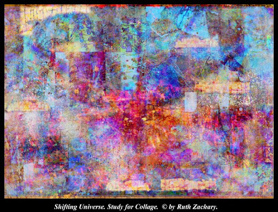
More Photoshop Experiments


 .

IMPROVE THE ODDS OF HAPPY ACCIDENTS Part 3

.
The next experiment is to use three layers in the same way as two layers are used in the previous exercise. The “mode” setting is applied to the top two layers in varied combinations.
.
Note: It is possible to work for hours and not find one happy accident that has potential to become a finished work of art. Other experiments may produce many images that can be the start of something really worthwhile. This approach can be quite time consuming.
.
There are certain elements of composition which make an image more or less effective. When combining layers in Photoshop, using the “mode” setting under the Layers tableau, to create accidental effects, choosing combinations that contain certain elements tend to produce better compositions.
.
These include: One layer with fine but varied textures, a second with medium to large shapes that will affect the division of the picture plane, and a third with medium sized patterns. A range of light to dark values in all three layers usually result a more dynamic composition. A combination of geometric and organic shapes will also create more interesting images. Usually. They are accidental, after all!
.
A good composition leads the eye of the viewer to various focal points within the picture plane, but creates enough interest to keep the viewer’s attention for a reasonable length of time. An all-over texture or pattern by itself tends not to offer enough variety to maintain that interest. The artist strives to learn what is effective in achieving this.
.
In the past demonstration, from April 26, three kinds of images were layered to produce a fourth image. Go back to that post to consider the following  points about the process of using modes in Layers. The first textural image feels unbalanced. The second is incomplete, and somewhat unsettling. The third (from a tie-dye) is exciting, draws attention, but is rather symmetrical, almost static, and can quickly lose the viewer’s attention. The fourth version, obtained by combining the previous three layers using mode adjustments is more interesting. The three rectangular shapes were created by copying parts of one area into other areas, but more work was needed to command the viewer’s attention. I would add some other shapes, keeping to an uneven number as this us usually more dynamic. I would like to accent the suggestion of depth. 
.
Later, I did take example #4, and added shapes to make it more interesting. Then I layered it again with two different textural images, resulting in the image above. One was a crackle texture, originally photographed from an old door. The other was a texture created in Kid Pix, which used paint tools, geometric divisions and outlining of the shapes thus created. Experiments with these three layers resulted in an image close to the one shown above.  I made color adjustments, dark and light adjustments, and contrast, to deepen areas of the composition. You can see the resemblance to the tie-dye configuration, but now the picture plane contains areas of emphasis, textural interest, and areas of hazy mystery, with a hint of depth.
.
This is a study. At some point I will probably print it out. Other papers of related colors and shapes will be added and moved around until the whole is transformed into a pleasing environment where I want to take a vacation for a while.When it seems finished, I will  eventually show the finished collage.


.
Images and Writing are Copyrighted  © by Ruth Zachary.

Monday, April 26, 2010

ANOTHER EXPERIMENT IN PHOTOSHOP!


USING PREVIOUS HAND MADE IMAGES IN PHOTOSHOP TO CREATE NEW WORK.

The first three layers, scanned into my computer separately from previous works were layered into one Photoshop document and resulted in the fourth image. To achieve this,  I pulled down the menu for various modes in the Layers Tableau, and kept selecting different modes in the box, for each of the top two layers. As each layer was changed, it affected the image seen on the screen. Numerous options are possible with this method.  I know how each of the original  images was made. The first was begun in KidPix, using the paint tools to create the linear textures. The second was a fabric piece from a hands on tie-dye  workshop later sewn into a vest. The third was an abstract painting incorporating collage. Next I saved each desirable image as a separate merged document. The last step was to alter those resulting images by adding shapes, repeating shapes, changing colors, sizes and the orientation of some sections within the picture plane. 


Images and Writing are the Copyright © of Ruth Zachary.

Monday, April 19, 2010

EXPERIMENT WITH PHOTOSHOP!

.

 PHOTOSHOP CAN WORK FOR PAINTERS, TOO!
.
If you are an artist who likes experimental techniques, this method offers infinite possibilities! If you have a full version of Photoshop, and a scanner, or a digital camera, you can try this. Start with a stack of paintings that aren’t finished, photographs of nature’s textures, or some experiments with painting techniques. Import the images into your computer, at about half the size you would want a finished piece to be.  
.
I chose a photo of an old still life originally painted in oils, a recognizable subject, to demonstrate the technique will work something realistic or completely non-objective. All my layers were about the same size in inches and the dpi count. This image was 12x18” and 300 dpi. (Dots per inch)
.
The second layer imported was from a painting experiment with spattered paint, and washes of run and flow in blues and greens. A box will appear showing the two layers.
The top layer was made active. (The highlighted box shows which layer is active.) An eye in both boxes shows that both layers are visible. The active layer will be affected by what you do to it. It may be predictable, but so far I haven’t found controlling the method results in anything better than I have created purely by accident.
.
The experimental part of the exercise was to change the mode of the top layer. (Look for the little box above the layers that says “Normal”) A pull-down menu will allow you to run through each of the modes, one at a time. The top layer, if active, will create changes with the bottom layer in combination. Try each of the modes to see which version(s) are worth saving.
.
Do a “save as,” to save the version you like as a jpg, a pdf, or other type of document. The layered version in Photoshop will remain unsaved, so you can keep checking all the mode versions you want to save.
.
Another method for further experiments is to change the top or bottom layer by rotating it, flipping it vertically, horizontally, or by changing the color. The subsequent versions in the same modes may be completely different than from the first run-through. The examples pictured show the change made to the original still life. Ultimately I saved two versions of the still life.
.
Some versions may not retain recognizable imagery. It is up to you to decide what to save, and if you like the composition of an abstract versions of your experiments. Ultimately I use the textures or images printed out from these combinations, in collage.
.
What I love about this approach is that I am not creating an artificial texture by using a filter. I know the painted textures are original because I painted them myself! And the choices are all mine. The computer is my studio, and my set of tools. It maximizes my creativity because it offers unlimited choices!
.
Writing and Images are the Copyright © of Ruth Zachary.

Tuesday, April 13, 2010

COMBINING ORGANIC WITH GEOMETRIC COMPOSITION


.
Combining Geometric with Organic Motifs in Abstract Composition
.
The above composition is an example of the dynamic effect achieved by combining both organic motifs and geometric elements in the same picture plane.
The pale marbleized textures are contrasted to the sharp straight lines of the geometric shapes. The repeated narrow black shapes remind me of piano keys.
.
The general effect of the geometric shapes is one of looking straight down at a design with the same depth of field, which creates a two-dimensional composition.
The curved lines and shapes, if predominant could create an impression of depth, or three-dimensional space.   
.
In the future I will include examples of organic-geometric combinations, which produce different effects, and attempt to explain how they exemplify particular elements of design and principles of Composition.
.

Images and Writing are the Copyright of Ruth Zachary ©

Tuesday, April 6, 2010

Composition with Abstract Art


Composition, whether it contains recognizable imagery or is limited to purely non-objective content, is much the same process. Shapes or forms of varied hues and values, lines, movement, balance, are arranged to create interest, and hopefully to keep the viewers interest for a period of time. Collage is a medium which allows moving shapes, lines and colors around within the picture plane before adhering the papers to a background.

The three images above show the steps this composition went through before the final version was chosen, and also that after choosing the final arrangement, many changes may continue to be made, using acrylic paint. (Not all the images were allowed on this post,  but the numbers will identify the order of creation)

In the first is shown the original computer concept. In the second, is the rearranged version, also on the computer. Paper textures scanned into the computer were used to come up with the layout, and printed out with colorfast inks on archival papers. The computer study was printed out as well, as a 4x6” image to work from. Working small initially helps me to overcome the difficulty I often have with larger scale proportions. The floral images were included at the end to convey the idea of a garden concert. The final image was size 18x24.”

Acrylic medium was used to adhere the papers to the canvas, and the finished image, which included tonal washes of acrylic paint to strengthen the composition, and the black border, was sealed with acrylic varnish. The final image was a photograph of the piece. I am having difficulties with my ten- year old camera, and put it on auto focus, which still comes out a little blurry.

The piece expresses a sad theme, using letters written home from soldiers in Iraq, which is why I called it Concert in Blue Flat Minor.

This piece was shown about one year ago in Greeley’s Madison and Main Gallery for the annual Garden Show.

Please note: I have a new blog site, which features Abstract Art Exclusively. Go to Google and ask for Mixed Media Abstract Art by Ruth Zachary.

This site is about the techniques of creating art, especially in photo montage, and in mixed media collage and includes the various kinds of art I have made in the past, or am creating in the present, and includes both abstract art and realistic art.


Images and Writing are the Copyright © of Ruth Zachary.


Monday, March 29, 2010

The Value of the Thumbnail Sketch

This Winter Concert played on into Spring! I can't believe it took me a whole month to show the final result of this collage. (And there still may be more minor changes) As you can see the previous stage of planning this piece was not quite satisfactory. 

Ideally, changing the initial concept of a piece as the creative urge prompts, allows the most freedom of expression.  I have a problem working directly on larger pieces, but working on the computer to make a study where I can make changes is very helpful. It is a matter of scale, and since the change in my vision occurred, I am even more grateful to be able to do some of the work, especially the initial planning, on the computer. If others who see this also have a hard time working on a large scale, planning a composition as a thumbnail sketch may help you too!

Comments are Welcome!

Images and Writing are the Copyright © of Ruth Zachary.